His mission is to tell a story graphically... literally
Velasco says infographics should be simple and used when we are able to tell the event better than with text or photographs
Dubai: The National Geographic magazine retains one of the best infographics departments anywhere, and is just as likely to rent a helicopter if it's necessary for a infographic production.
A typical graphic will take at least half-a-year to finish, and the more complicated ones considerably longer.
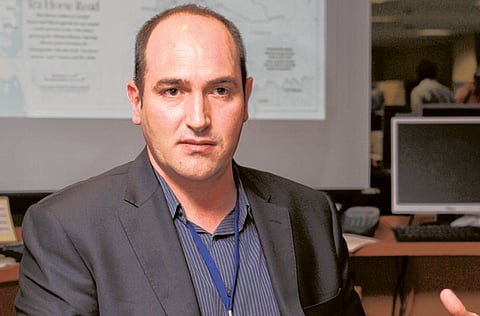
"We needed a skeleton to use as a base for drawing and sculpting, so we bought one for $15,000," Juan Velasco, art director at the National Geographic magazine, once said. On a visit to Dubai, he explains some of the important conceptualisation steps in constructing and planning graphics. Juan Velasco will make a presentation at the American University in Dubai in Media City on April 4 to share his experiences and provide an insider's view of the process of building better graphics and data visualisation. He will also have insights of the new iPad version of the magazine.
How has information graphics evolved?
Juan Velasco: A good information graphic always starts with good reporting and research. Graphics are journalism, and the process is the same used by a writer or a photographer in a newspaper.
First, gather all the information you need by doing research. Then, you need to be able to select the most relevant information and sketch out a visual narrative that is clear and engaging.
I encourage everyone to create lots of pencil sketches before they jump on to the computer. That will help you create a good hierarchy of dominant and secondary elements, a logical flow for the reader and good integration on the page.
Work together with the page designers. It's also important to write the text and start editing early, not at the end of the process.
I often see designers that create big, flashy illustrations and at the very end try to fit some text in any empty spaces available. The flow of text should be part of the initial sketches.
An information graphics specialist or a designer creating graphics should be able to be comfortable working with text, even doing some editing.
Once you have a good sketch, you should send it to your experts and sources to confirm everything is correct, and circulate it in the newsroom for editors' feedback. And then you can finalise the illustration in the computer or by hand.
At the end, it's important to do good editing of the text and send the final graphics to your expert for a last review.
What's going to be the role of infographics in the coming years?
We are in a really interesting moment with the beginning of new tablet devices. Many news organisations are translating their content to the iPad, and that includes creating interactive versions of their graphics without the possibility of using Flash, which is not supported by Apple.
So, we are all learning new ways of developing that interactivity with WoodWing or the new Adobe Tools that integrate in CS5. I think for the first time print designers and graphics specialists who never used Flash — because it is too technical or intimidating — will start doing interactive content because they will be able to do it directly within InDesign.
But the important thing, as always, will still be to tell stories with accuracy in an engaging and informative ways. Other than that, information graphics will continue to be an important tool to tell stories to readers who have shorter attention spans than ever and don't want to read.
These days some infographics are more complicated for an ordinary reader. Your thoughts on this?
I think you are right. There is a growing trend of "data visualisation" techniques that produce very sophisticated and "cool" computer images. The problem is no one can understand what they mean.
We always need to remember that readers don't have much time to spend on the newspaper or the magazine. If we give them something that is too demanding, too busy, or too difficult to understand, they will pass the page quickly.
Simple is always better. Sometimes graphics specialists do innovative formats to impress themselves and their graphics colleagues, or because they are bored of doing the same charts. But the reader is looking for simple understanding.
I also see too much text and too many elements in many graphics, which is overwhelming for the readers. It's better to explain one thing well than to give a complete encyclopaedia about an event.
How important is subject selection for infographics?
The subject matter is always driven by news, by the stories that are relevant now and need to be told to readers. Of course, there are topics that are better than others for infographics.
Good charts make sense of large sets of numbers and reveal the meaning and trends behind them. Cross sections show you what is inside, which photography cannot do. Timelines and flow charts clarify time events and relationships.
The decision to make an infographics should be a natural one, when it's a better tool than text or photography to tell a story.
How difficult is creating infographics for breaking news?
Creating good breaking news is very, very difficult because in most cases there is not good visual information available. But there is pressure from the newsroom to create large illustrated diagrams.
We are visual journalists and our main responsibility is to offer readers accurate information. It's always better to be honest and show less if we don't have details.
For instance, we can do just a small locator map of the place of an accident, and do a more complicated illustrated scene the next day when we know more details.
Inaccurate drawings will destroy your credibility very quickly.
For instance, in a robbery or a terrorist attack we never have too much information. Witnesses give contradictory descriptions because everything happens very quickly: the clothes of the robbers, the car they used to escape, the exact trajectory they followed.
Resist doing anything that is not confirmed by official sources and remember that in a drawing you need to be more precise than with words because everything is shown.
If you absolutely must do the graphic but don't have much information, use the text in the graphic to make clear it's reconstruction, a preliminary account, an artist concept.
And zoom out, get far enough from the action that you are not forced to draw too much detail.
The writer is Editor, Newspaper Design website.
GRAPHICS IN MAGAZINE AND NEWSPAPERS
Juan Velasco will be deliver a lecture at the American University in Dubai on April 4 at 6pm. More information www.snd20.org. Free entrance email: snd20@snd20.org


