Why designers embrace warm minimalism and textural depth for autumn-winter interiors
Interiors themes this autumn turn towards depth, warmth and quiet luxury
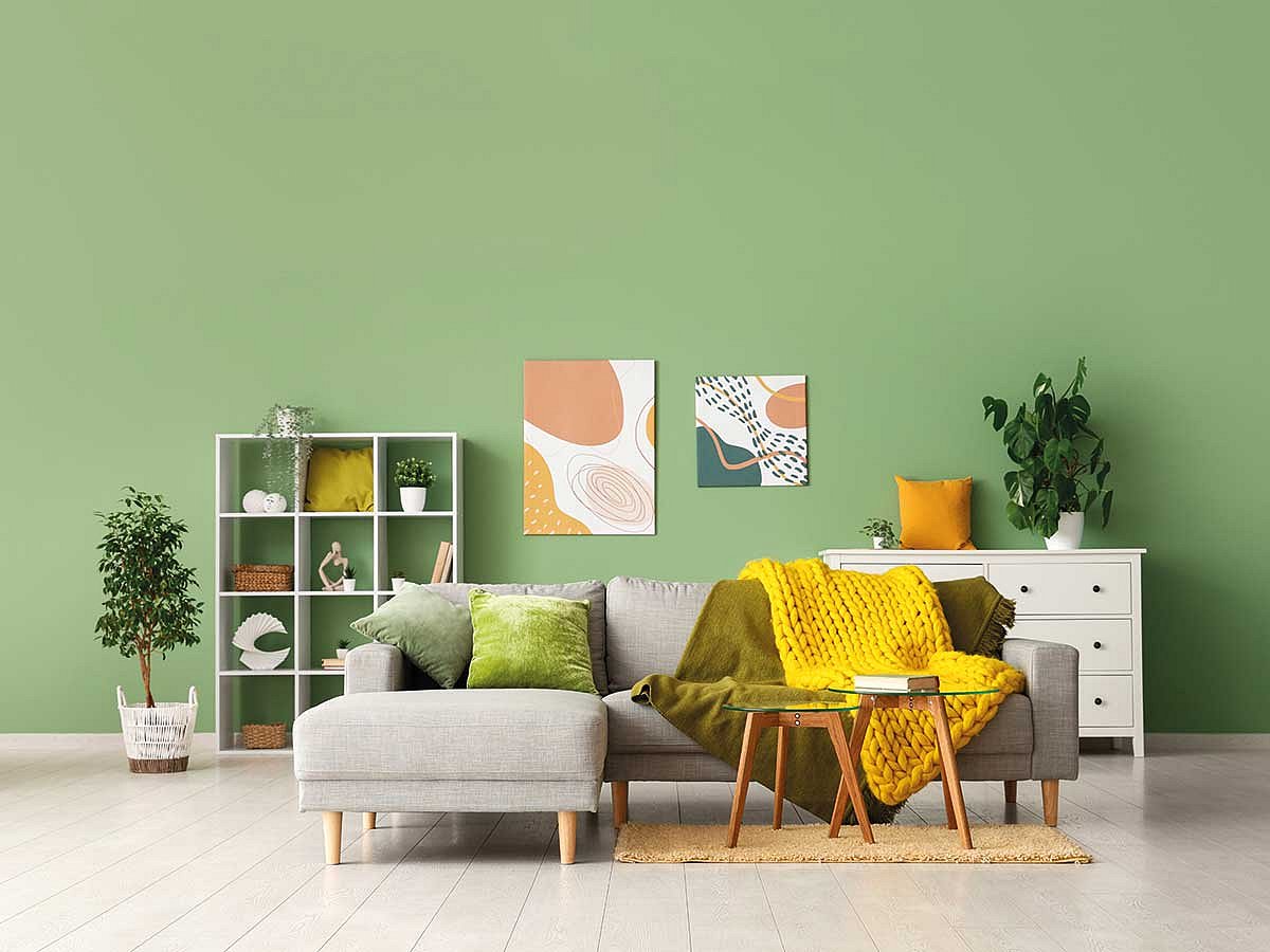
The first touch of cool weather always changes how a home feels. Light settles instead of bouncing. Fabrics begin to matter again. Wood looks richer. Metal glows instead of shines. Designers across the region say the new autumn-winter season is moving toward this exact feeling, the trend palette shaped by warmth, texture and understated luxury.
There’s no rush here, no loud trend cycle. Instead, interiors lean into depth and softness. Think atmosphere, not decoration, creating a room that makes someone exhale when they walk in.
Warm minimalism
The emotional register of interiors is shifting. The language that designers are using now circles around gentleness, grounding, and tactile comfort. In one view, the season is defined by materials that slow the room down, fabrics with weight, wood with warmth, metals that glow rather than sparkle.
Within this landscape, Massimo Imparato, Dean of the School of Architecture and Interior Design at Canadian University Dubai, sees a clear movement. “Interiors are shifting toward a more emotionally sensorial direction,” he tells Friday. “Autumn-winter feels like slow luxury and warm minimalism, an atmosphere built through tactility, depth and subtle material storytelling.”
That emotional depth is echoed by Marie Soliman, Founder and Creative Director of Bergman Design House, who leans into the season’s softness. “This season embodies a mood of quiet luxury and comforting warmth,” she says. “Warm metallics combined with rich textures create an inviting atmosphere that feels both timeless and intimate.”
Dubai’s climate brings its own nuance, designers say. For interior designer Anna Johny Kutty, autumn is less a dramatic temperature drop and more a gentle easing. “Autumn in Dubai is more like a ‘kinder summer,’ a sense of transition before the real chill arrives,” she explains. In her projects, that translates into spaces that are “cosy but bold,” with warm metals used as year-round anchors. They come alive, she says, when layered with fabric and depth.
Atmosphere becomes a character in its own right in the work of Nathalie Khouri, Creative Director at Ralee. Her take on the season centres on emotional comfort. “Comfort with individuality is the theme,” she says. “Homes feel like a warm embrace after an exhausting day.” She compares aged brass and gold to candlelight, explaining how their soft glow creates a sense of invitation. Paired with textured materials, they build “the depth and warmth that we all want during the colder months.”
Texture and emotional grounding shape the season for Yulia Sukhanova, Co-Founder and head of COLABB Interior, who sees a shift toward gentler interiors. “People are craving spaces that feel personal, tactile, and emotionally grounding,” she says. Metals, used well, transform with the light. “Warm metals like brass, bronze and copper come to life in a softer way. They add a quiet kind of luxury, the kind that glows rather than shines.” When matched with velvet or textured fabrics, she says, the room becomes intimate, calm, and quietly luxurious.
Art of using metallics
Gold, brass, and copper are everywhere this season, but every designer agrees on one thing: restraint is key. Metallics are not meant to dominate a room. They’re accents, punctuation that shapes mood.
For Massimo, the rule is clarity. “Metallics should be used as punctuation,” he says. “Moments that highlight or contrast, rather than the dominant voice.” Pairing them with matte textures keeps the palette warm and grounded.
Anna approaches metal with the precision of someone who has seen them misused often. “Intentionality matters,” she says. She avoids bright yellow golds, red brass, or orange-toned copper. When clients want those shades, she tones them down. “Choose a satin finish instead of brushed or polished,” she explains, because satin brings calm rather than glare. She loves champagne-gold metal with ash-toned wood, especially in kitchens.
Her “less is more” guideline is simple: “If you use gold in your lighting, avoid repeating it everywhere and across all your furniture.”
Nathalie sees metallics through the lens of subtlety. “Metallics should whisper rather than shout,” she says. She likes mixing brushed and matte finishes, which soften the light. Natural materials help keep the metal grounded. “Think of them like earrings on an outfit,” she adds. They should always be the finishing touch, never the full statement.
Yulia treats metal like jewellery for the home. “It should highlight, not dominate,” she says. Her preferred uses? Table legs, mirror frames, cabinet handles. Cohesion matters. “Stick to one tone per room,” she says. Satin brass is her go-to in the UAE. “It doesn’t glare under strong sunlight and creates a diffused glow in the evening.”
Marie aligns with this less-is-more mindset. “Metallic accents should serve as accents, not statements,” she says. She pairs warm metals with natural materials such as wood or linen so the metal reads as warmth, not flash. This, she explains, keeps a room sophisticated and approachable.
Texture takes centre stage
Layered texture is the real language of this season. Designers keep returning to the same idea: warmth doesn’t just come from colour, it comes from touch.
Massimo’s approach is simple. Velvet, linen, and wood form his base. “Layering rugs and mixing tactile fabrics with natural materials adds depth,” he says. Colours stay cohesive so textures can do the work.
Anna guides clients through texture by starting with harmony. “There’s no strict rulebook,” she says. “But it’s a fine line between cohesive and cluttered.” She keeps wood tones and fabrics aligned. Beginners should stick to solid colours first, she suggests, then add one or two patterns with the same palette. She insists on seeing wood samples together. “Autumn means deeper, warmer browns,” she says. Tone and undertone change everything.
Nathalie sees texture as a building block of comfort. “A chunky knit throw, a velvet cushion, and a linen sofa, that’s what brings a room to life,” she says. Organic elements like rattan or wood keep the mix grounded. For her, contrast is the secret: smooth with rough, warm with cool.
Yulia thinks of texture as emotion. “I love when you can feel a space,” she says. She begins with linen, cotton, or natural wood, then layers velvet or bouclé over it. “Smooth next to textured, cool next to warm... That’s what creates depth and comfort.” To her, texture is what makes people want to stay in a room.
Marie uses texture to build narrative, such as at the Mondrian Al Marjan Island Beach Residences. The inspiration came from natural rhythms: Sea, sand, horizon. “Combining sculptural forms with organic textures creates interiors that are immersive and emotionally resonant,” she says.
Small spaces, big warmth
Compact homes can still feel layered and inviting in winter. Across all the design practices, the advice is laser-focused but practical and well suited to the UAE.
Warm textiles come first. Lighting layered at different heights matters just as much. Mirrors amplify daylight. Reflective surfaces open rooms without clutter.
Massimo suggests mixing scales. “Keep furniture scaled to the room and mix high and low finishes,” he says. A sleek low table with a velvet chair or metallic lamp adds elevation without crowding.
Anna’s non-negotiable is mirror placement. “Mirrors work because they reflect light and create the illusion of depth,” she says. She warns against tiny furniture. “Well-proportioned pieces anchor the room,” she says. Let natural daylight do its bit with the rest. “Dubai’s winter light can expand even compact rooms,” she says.
Colour families help small spaces stay calm, something Nathalie leans on often. Matching tones across the room builds continuity. Multifunctional pieces keep clutter down. “Warm colours and a few layers of texture can drastically alter the atmosphere,” she says.
Vertical thinking shapes Yulia’s method. “Long curtains, tall lighting, slim shelving,” she explains, each draws the eye upward. She embraces deeper tones in small rooms. “When lighting is warm, olive or terracotta can feel more refined than beige.”
Finally, Marie’s approach is about unity. “Start with a unified palette and layer through light and texture,” she says. Mirrors, soft lighting, and multifunctional furniture keep the space open. Vertical textiles add presence without overcrowding. Plenty to work with, then!
Sign up for the Daily Briefing
Get the latest news and updates straight to your inbox
Network Links
GN StoreDownload our app
© Al Nisr Publishing LLC 2026. All rights reserved.