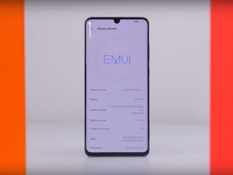
Huawei EMUI10: Beyond the Beauty
Here is what you need to know about Huawei's EMUI10 rolling out in September
Huawei’s EMUI has undergone rigorous development since its inception 7 years ago. The company has evolved its software gradually which started with the basics and involved adopting a unique design, to then encompassing not only simplicity but also natural elements into its UX. With the new EMUI10, Huawei wants to deliver an operating system with high operation consistency and an experience full of enjoyment.
Magazine design philosophy
When developing EMUI10, the design elements of magazine aesthetics such as white spacing and bigger headlines were adopted. These changes are instantly noticeable in the notification menu, which now has larger icons that are easier to interact with due to the large spacing between them.
Changes such as these are also evident throughout Huawei’s Contacts application, Notepad and the Photo Gallery application. Additionally, specific to the Settings application, its classification is now clearer whereas the shape of the setting icons has changed from square to round for a smoother look.
Morandi color palette
Making for a refreshing look throughout the entirety of the operating system, EMUI10 adopts the Morandi color palette. It originates from a famous Italian painter Giorgio Morandi whose motive was to create a careful balance of subdued colors and subtle tones.
By doing so, the operating system remains elegant for everyday usage. This change of palette is visible notably in Huawei’s Contact detail page and in tips.
Smooth animation
A range of small changes have been implemented into EMUI 10 which enhance the overall smoothness of operation. Spring motion when pressing an application gives users a different visual feedback depending on the area of the object being pressed.
With the operating system, Huawei has doubled the number of frames in a transition animation to make usability more natural. You can also take advantage of different swipe trajectories which implement real life projectile trajectory motion based on the laws of physics. The animations here are based on releasing points, swiping speed and dragging directions.
Upgraded camera UX
In line with the rest of the operating system, the camera application receives a major overhaul with EMUI 10. The interface adopts a refreshing change which makes camera features clear and intuitive to use and understand.
These changes also affect camera font style and the adoption of a visually clean looking layout that is simple yet dynamic.
Human-factor based dark mode
In EMUI10, dark mode isn’t simply the reversing of black and white colors. On the contrary, Huawei has done a range of research to determine the most comfortable color range based on human factor testing.
During this, its ambient light lab simulated four different light intensities, tracked eye movement data, studied long-term comfort and determined the most comfortable contrast ratios for text and icons. Using these results, Huawei was able to make small changes to its dark mode which may not be immediately noticeable but are impactful in the long run.
The HUAWEI P30 series will be the first to get the EMUI 10 Beta update starting September 8 across global markets, followed by the roll out to the HUAWEI Mate 20 series and other Huawei phones.
This content comes from Reach by Gulf News, which is the branded content team of GN Media.