'A fire-breathing chicken': Fans react to HBO's new Harry Potter Hogwarts house crests
The new designs drop the heraldic shields, but restore Ravenclaw's book-accurate eagle
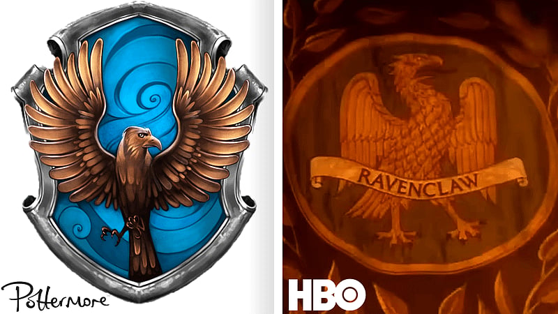
Dubai: The four Hogwarts houses have new crests, and the reaction online has been swift and largely unimpressed.
HBO unveiled the redesigned emblems for Gryffindor, Slytherin, Hufflepuff and Ravenclaw at a Back to Hogwarts event in Australia, timed to 1 September, the date Harry Potter and the Philosopher's Stone was first published and the date the Hogwarts Express departs in the books.
The new designs strip out most of what the films made familiar. Where the Warner Bros. crests were heraldic, with each animal mounted on an intricate shield in the style of a medieval bestiary, the television versions place each mascot inside a plain coloured circle ringed with simple decorative flourishes. The line work is far thinner. The animals read as stylised rather than ornate.
The complaint
The objections cluster around the same point. The originals felt like coats of arms, which is what a crest is meant to feel like. One fan described the new versions as the informal edition. Another argued that when you picture a Hogwarts crest, the film design is the one that surfaces. Someone compared Ravenclaw's new eagle to a fire-breathing chicken.
There were also complaints about the finish rather than the concept, with several people noting that the silver in the released images looks gold and hoping higher-resolution versions will clear it up.
The Ravenclaw change is the interesting one
Buried under the aesthetic argument is a decision that goes the other way.
Ravenclaw's crest now carries an eagle. In the books, the house symbol has always been an eagle. The films used a raven, presumably because it matches the name, and also swapped the house colours from blue and bronze to blue and silver.
HBO has put the eagle back, which is a direct correction of a film-era departure and consistent with the series' stated intention to follow the novels more closely than the movies did.
Gryffindor keeps its lion, Slytherin its serpent, Hufflepuff its badger.
Part of a pattern
This is not the first design row of the marketing campaign. The school's own crest was revealed earlier and does away with the four-animal coat of arms entirely, replaced by a golden letter H with roots below and branches above, like a tree. According to Wizarding World, the franchise's official news hub, that simplification was deliberate.
The broader visual direction has been consistently darker than the films, with muted, moodier colour throughout the promotional material rather than the saturated palette of the eight-film run.
The series premieres in December.
Network Links
GN StoreDownload our app
© Al Nisr Publishing LLC 2026. All rights reserved.