iPhone 18 Pro Max colours: Burgundy anyone? When phones became a fashion choice
From muted metal to Burgundy bold: How iPhones became fashion statements
That bright orange. And then along came burgundy.
Whew.
Well, now you look for an iPhone that matches your outfit.
There was a time when choosing an iPhone colour was barely a decision. Black, silver or gold, and you got on with your life. Your phone was a gadget, not an accessory. Now, that idea feels vintage.
An iPhone sitting on restaurant tables, peeks out of handbags, shows up in selfies, and spends most of its life tucked into a case chosen just as carefully as the phone itself. Its colour can say minimalist, playful, nostalgic, flashy, and well, you would notice it.
The colour is now a personality.
The years when your phone was supposed to behave
For much of the iPhone's early life, colour meant restraint. The original iPhone came in black, and for years Apple stayed within a safe palette, black, silver, gold, space grey.
These weren't really colours so much as finishes: polished, expensive, unlikely to clash with anything you owned. Your iPhone could signal that you'd upgraded. It wasn't supposed to say much about you.
Then Apple started loosening up.
The iPhone became an accessory
The iPhone 5C in 2013 was one of the first signs Apple was willing to have a little fun, white, pink, yellow, blue, green, in a colourful plastic body that looked nothing like the more serious iPhones around it.
The reaction was mixed. Critics and fans alike questioned whether the bright colours made the phone look too playful, even cheap. But the 5C proved something: a smartphone didn't have to look like office equipment.
Two years later, Apple found a colour that went much further. Rose gold, on the iPhone 6s in 2015, escaped the world of smartphones almost immediately — turning up on laptops, watches, headphones, jewellery, stationery, home décor. It stopped being a phone finish and became the accessory.
Red came with a message
Red meant something different again.
Apple's (PRODUCT)RED iPhone, introduced in 2017 through its partnership with (RED), let buyers make their phone colour meaningful rather than just decorative — a portion of proceeds went to charitable programmes. For once, the colour said something about the person holding the phone, not just their taste.
The last iPhone to get a (PRODUCT)RED version was the iPhone 14 in 2022. It didn't return with the 15, or any generation since.
Then the Pro finally got some personality
For all Apple's experimentation with the standard iPhone, the Pro line stayed conservative. Regular iPhones came in pastels and greens; Pro buyers got restraint. The logic seemed almost amusing: if you're paying flagship prices, presumably you want it to look expensive.
That changed with the iPhone 17 Pro's Cosmic Orange in 2025 — suddenly Apple's most "professional" phone wore one of the loudest colours in the lineup, and people noticed. The shade became a talking point in its own right, and it spilled straight into the accessory ecosystem: cases, chargers, and other gear shipping in matching orange within weeks.
The Pro iPhone had stopped trying to blend in.
Colour is now part of the launch ritual
Every iPhone launch comes with the same checklist: camera, battery, chip, price. And then the question that has nothing to do with specs — which colour are you getting?
The answer isn't about technology anymore. It's about what you want sitting in your hand, on your desk, next to your coffee, for the next few years. You might play it safe. You might want the new one simply because it's new. You might pick whatever matches your favourite case — or deliberately choose the one that makes people ask what phone you have.
That's a very different job for colour than the one Apple originally gave it.
Now the phone colour is the trend
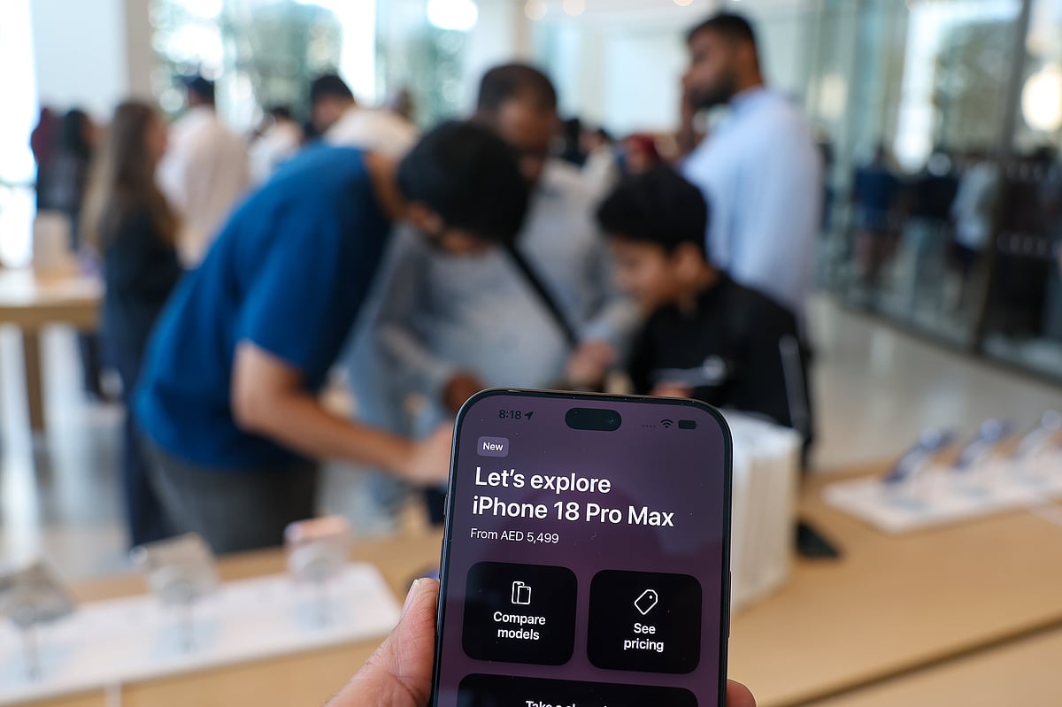
Which brings us to Apple's latest Pro shade: Burgundy, a deep red with purple undertones that shifts with the light.
Here's the twist. By the time Apple officially unveiled it, Xiaomi, Huawei and Tecno had already shipped phones in near-identical red tones, some launches timed almost deliberately to ride the same leak cycle that now surrounds every major release.
Once, phone colours were finishes meant to age for years. Now colour shows up in teasers, drives its own social posts, and decides which accessories people buy before the phone even ships. It can make two versions of the same device feel like entirely different products.
Your phone used to match your wardrobe by disappearing into it. Now, increasingly, it's part of the wardrobe.
Network Links
GN StoreDownload our app
© Al Nisr Publishing LLC 2026. All rights reserved.