What happened to technicolour?
With the invention of digital colour-grading, the practice of tweaking the palette of films in post-production has exploded
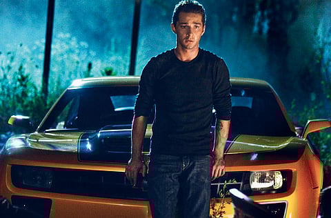
Film fans might have noticed a colour revolution in cinema recently, because Hollywood seems to gave gone teal-and-orange crazy. Studio films from Hot Tub Time Machine to Iron Man 2 have used the combination, with the greenish-blue teal forming a backdrop and the orange (which includes flesh tones) in the foreground.
The film blogger Todd Miro has suggested it's all down to the colours being complementary: "Anyone who has ever taken Colour Theory 101 knows that if you take two complementary colours and put them next to each other, they will ‘pop', and sometimes even vibrate," he wrote, posting dozens of stills from the year's big movies, united by the prevalence of teal and orange.
Direction
It's no conspiracy, though, says Stefan Sonnenfeld, a leading Hollywood colourist who worked on the Transformers films (Miro counts them among the main offenders). "There's no specific colour decision-making process where we sit in a room and say, ‘We're only going to use complementary colours to try and move the audience in a particular direction — and only use those combinations,'" he says. "Every film has its own look. We are always pushing our tools and our creative capabilities on every project."
It took Miro's accusation to bring to light one of cinema's hidden arts. Colour grading, in which a film's palette is altered in post-production, has become more prevalent over the last decade, as digital technology has erased the limits on what can be done.
In 2000, O Brother, Where Art Thou? became the first film to be scanned on to a hard drive in its entirety to create what the labs call a digital intermediate (DI) print, ready for the colourists' virtual crayons; the Coen brothers, of course, went to town with the sepia on that one. Now everyone follows suit with their chosen colours.
"Colour-grading is an absolute necessity now," says Sonnenfeld, "Because there are so many different formats that are being used, from film stock to digital capture, semi-professional to consumer cameras. Blending all that stuff and having it work cohesively is a very important part of the process."
Contrast, lighting
The special effects explosion over the last decade has been good news for colourists, offering a constant stream of work as spectacular effects are worked into films: "Special effects [only] come to life when you transfer them digitally," Sonnenfeld says.
"When we integrated the robots for the first time in Transformers, it was amazing. And that all has to do with contrast and lighting. We went back and forth so many times. [Director] Michael Bay is a genius at that."
Nowadays 3D is the brave new frontier for colour grading. Alice In Wonderland was another recent Sonnenfeld job, and his team constructed two different palettes for the 2D and 3D versions — because the latter demands greater colour depth.
At the other end of the scale are the desaturated action scenes that have been with us since Saving Private Ryan, the dialled-down tones transporting viewers back to the hyper-adrenalised state of fight-or-flight lurking in the deepest, most reptilian parts of our brains.
The best colourists, says Sonnenfeld, push those primal buttons: "It's a latent tool. It's got this hidden power. And you don't necessarily realise how important it is until it's done incorrectly."
Sign up for the Daily Briefing
Get the latest news and updates straight to your inbox


