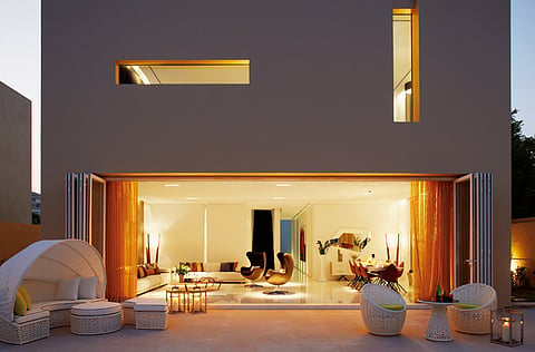
Warmed up minimalism in Umm Suqeim villa
This Umm Suqeim villa is the epitome of contemproary cool

Umm Suqeim is an established suburban neighbourhood renowned for its community feel, older-style villas and tree-lined compounds. Standing out from the crowd with its beautifully sleek contemporary lines is a recently completed renovation that is a welcome burst of modernism.
The Emirati homeowner is a well-known advocate of the burgeoning modern art scene in the UAE. A keen art collector, he wanted a home that felt almost gallery-like – a blank canvas where he could build up his art and sculpture collection.
To help him make this vision a reality, he commissioned Zen Interiors and its lead designer, Hadeel Abu Baker, who set about devising an interior scheme that was just as stunningly simple as the exterior.
“The linear, contemporary architecture of the facade was my inspiration for the interiors,” she explains. “And as the homeowner has very minimalist tastes, I knew the direction I needed to take in choosing sleek, uncomplicated furniture that was beautifully designed yet unfussy.”
A masculine palette was chosen for the home, and in the downstairs living area a retro feel also creeps in with the colour combination of brown wallpaper by Rubelli Sahco, and mustard yellow and dark blue soft furnishings. Reproduction Arne Jacobsen Egg chairs also add to the late 1950s look.
The white sofas and coffee tables are from Natuzzi; “I love these low tables,” says Hadeel. “I chose one with a glass top and one with wood to create a kind of void and mass feel; they are the same, but different.” T
he floor-to-ceiling windows that run the length of the room were changed into panelled folding doors, and sheer curtains with a net texture were chosen from Rubelli Sahco to give an added degree of privacy from the neighbours, while still retaining lots of light.
The dining room could still be considered modern and minimalist, but by choosing signature pieces from flamboyant Egyptian-Canadian designer Karim Rashid, the look is also fresh and young.
To break up the monotony of the narrow corridor that leads to the suites, a brick-effect wallpaper by Elitis in a very pale pearlised cream is used – adding a subtle industrial feel to the space.
Moving into the master bedroom, a Minotti bed from Aati and bedside cabinets from Ligne Roset are teamed with sculptural lamps from Galeries Lafayette.
Shades of grey are introduced into the scheme with a beautiful Rubelli wallpaper that boasts an understated pearl effect, which gives the room a warmer tone. Fabrics from Armani Casa were used for the bed cushions and runner.
“This was a really enjoyable project to work on,” enthuses Hadeel. “Our client has very discerning tastes, yet gave me a free rein to turn his vision into reality. I was left to design and specify the items that I thought would look best, which made the process quicker, yet more daunting at the same time!

