Arabic typeface catches the fancy of designers
Efforts being made to reaffirm Arab identity at corporate level
Dubai: "There aren't enough Arabic typefaces," said typographer Tarek Atrissi.
It wasn't so much an observation as it was a declaration. One that blatantly shouts out — there is high demand for Arabic fonts, less supply.
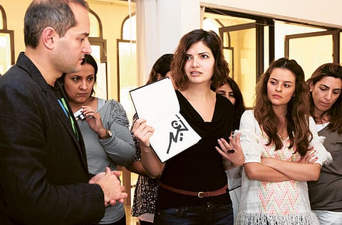
This fact is singlehandedly encouraging type designers and graphic design students in the Middle East to do something about it. That something was clear from Atrissi's recent workshop titled Arabesque, Identity and Arabic Typography, organised by Nuqat Design Conference 2012, where students were sketching forms of Arabic lettering.
"There is a boom in branding. For unique branding — whether it is signage or a logo — you need a unique typographic voice. Companies are searching for unique typefaces. Companies are trying to reaffirm the Arab identity on a corporate level," Atrissi told Gulf News.
The co-host of the workshop, type designer Nadine Chahine, added: "Companies in the Gulf have more budgets for branding. Given that typeface is an integral ingredient [in branding], there is new interest in Arabic type. Now some of these students at the workshop may be able to expand the letters they have sketched into a system and further develop it into a font."
Both lecturers are industry experts.
Attrisi has a design studio (www.atrissi.com) in the Netherlands. An author and a lecturer, he is a frequent guest speaker at several universities and design seminars across the world. His work has been exhibited at the Guggenheim Museum in New York.
Chahine works at Linotype, Germany, a global provider of superior quality typographic products and services. She has more than 18 fonts to her credit including the best-selling Frutiger Arabic and Koufiya.
Growing industry
Through the workshop Chahine and Atrissi taught approaches to Arabic typography. "To design good typefaces, it is important to understand calligraphic tradition. You have to look at the styles, the characteristics of each [style] and how you can interpret them," explained Atrissi.
"Everything we do is based on this calligraphic skeletal structure. Once you understand the skeletal system, you can dress it differently — sometimes conservative, sometimes modern," said Chahine.
Graphic design student Danah Behbehani had travelled from Kuwait to attend the workshop. She told Gulf News: "The graphic design industry in the Middle East is growing. There aren't enough fonts to use and complement branding for new business, publications, etc. I know of only ten Arabic fonts compared to English — too few. It is very ‘in' coming up with new fonts."
Another student print-based designer Farah Behbehani, also from Kuwait, said that the Arabic typeface has come of age. She told Gulf News: "It is a technical field. There have been so many designers in the West designing the English typeface, but in the Arabic world, not many or of good standard, until recently. Only a few have had the discipline to pursue this career."
Of the rise in the Arabic typeface Chahine and Atrissi said the future is bright: "Arabic font is getting cleaner and more modern. We are witnessing liberation with new designs. Technology has helped too in terms of software and support," said Chahine.
Atrissi expects more experimentation as people get trained. "This translates into a brighter future in the development of Arabic type," he said.
When asked whether a single Arabic typeface will rise to ubiquity like the English type Helvetica, Chahine mentioned that she designed the Arabic companion to the iconic Neue Helvetica typeface.
"In Arabic, the situation is a bit more complex. When Arabic calligraphic styles were developed, they were developed for specific sizes in mind. You can use Helvetica for text and headline, which is why you see it in software and emails as well as in big logos like GAP and American Airlines. Helvetica can cross the boundaries between headline and text. In Arabic, you can't do that," she said.
The field is still in an inchoate state, and according to Chahine and Atrissi who are working on a book titled Right to Left: Typographic Dialogues on Arabic Literature, one can only look back 10-15 years from today to judge what was successful.
‘Unpredictable'
"Every designer has their own intuition as to what is good or not. There is no science. It isn't always easy to predict how some design elements become iconic and become part of our culture. Take the ‘I love New York' logo that became part of a bigger cultural element, and has inspired countless knock-offs. The unpredictability is the interesting part," he said.
One yardstick is sales said Chahine: "At Linotype, see a big demand for typefaces that are modern and non linear."
On a related note, she said typeface shouldn't ignore the legibility aspect. "We have to ask designers, educators and typographers and even the publishing industry at large — what style of Arabic helps with reading? Design in that sense is very important but it should not attract attention to itself. You should engage with the content and not the way the letters are dressed."


